Spacing
Available since 1.0.0
Spacing helps content to breathe as well as create hierarchy and depth. It ensures optimal readability and space efficiency, all heights and widths are calculated from a base unit or 4.
Base Unit of 4
All spacing is divisible by 4, the list below includes the most common spacing increments we use.
| Tiny 8px |
Small 16px |
Medium 32px |
Large 48px |
Spacing Usage for padding
SCSS Mixin: @include fd-space([$size) | Helper class: .fd-has-padding-[size]
padding using tiny spacing option
padding using small spacing option
padding using medium spacing option
padding using large spacing option
<div class="fd-has-padding-tiny">
    <code>padding</code> using <code>tiny</code> spacing option
</div>
<div class="fd-has-padding-small">
    <code>padding</code> using <code>small</code> spacing option
</div>
<div class="fd-has-padding-medium">
    <code>padding</code> using <code>medium</code> spacing option
</div>
<div class="fd-has-padding-large">
    <code>padding</code> using <code>large</code> spacing option
</div>
Spacing Usage for margin
SCSS Mixin: @include fd-space([$size) | Helper class: .fd-has-margin-[size]
margin using tiny spacing option
margin using small spacing option
margin using medium spacing option
margin using <div class="fd-has-margin-tiny">
<code>margin</code> using <code>tiny</code> spacing option
</div>
<div class="fd-has-margin-small">
<code>margin</code> using <code>small</code> spacing option
</div>
<div class="fd-has-margin-medium">
<code>margin</code> using <code>medium</code> spacing option
</div>
<div class="fd-has-margin-large">
<code>margin</code> using <code></code> spacing option
</div>Sections & Panels Spacing
For common content areas such as lists, tables, cards, or forms, there is a system of sections & panels that work together to create a consistent visual layout.
Sections
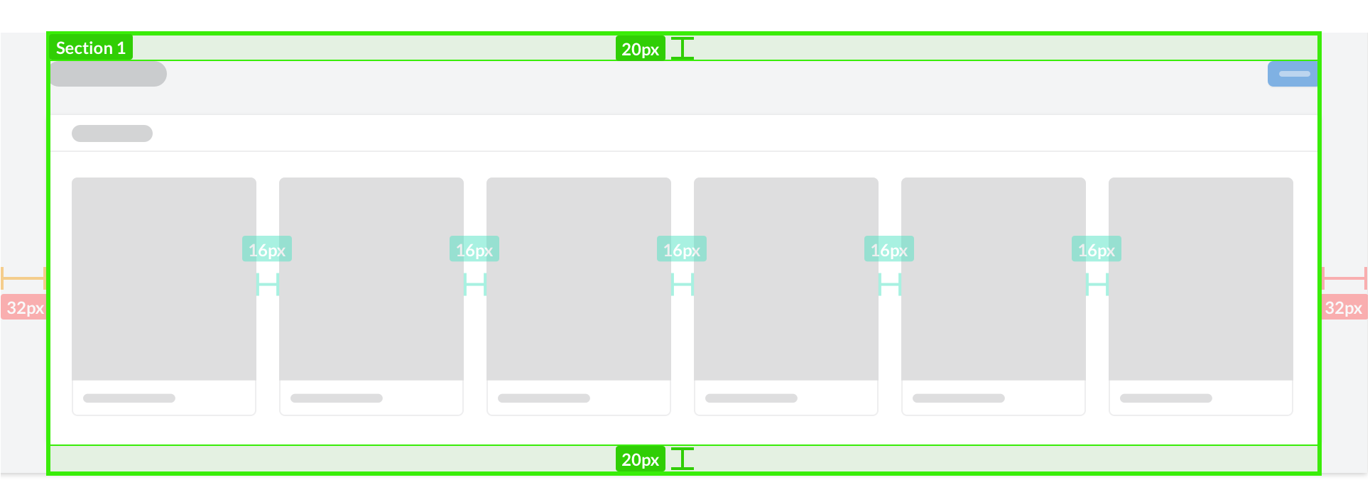
Sections are the outter most containers for all content. They can contain any combination of components. Each Section has 40px above the content area and 20px below. All components and information contained within the content area will use their own padding and spacing.
Panels
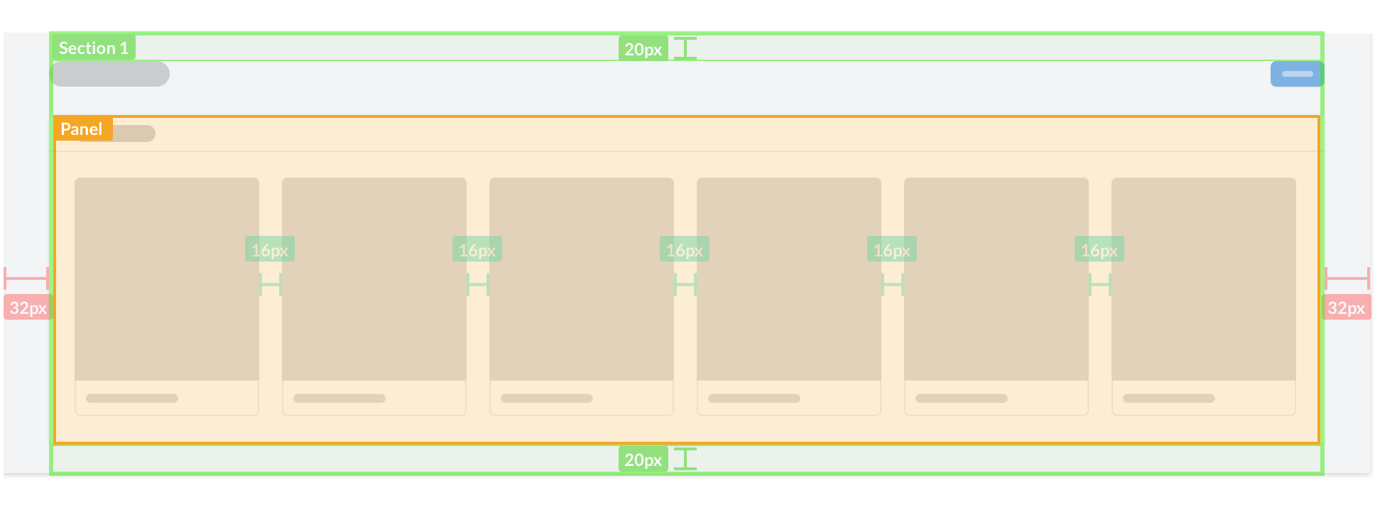
Panels are always contained inside a section and most commonly used when there are 2 panels side by side inside a section. Card grids, however, follow their own spacing system independent of sections or panels.
